Monday, December 7, 2009

winter fun


These snowboards were designed specifically for women, but I would argue that they would be appealing to men as well. I know that may not mean much coming from a woman, but it seems as though bright colors and pop art are a theme across fashion for both genders. These boards are stylish, hip, and retro. I wish I knew how to snowboard so that I had use for them! I found these designs in the December issue of "HOW."

Monday, November 30, 2009

Hey, do you have a piece of gum?


This is a clever design. I think that Dell had a good idea in portraying their colorful computers as gum in these advertisements. It makes them appear to be something easily attainable, widely used, and fun! I don't even like gum too well and they grabbed my attention!
I found these images in the November issue of "PDN."

Monday, November 23, 2009

It's all about the people


Many of you may have seen this image before. I believe I've seen it on the news before and it was used for the cover of Newsweek in their inauguration issue, "Obama's America." It was featured in the July/August issue of Communication Arts, though. I just think it demonstrates amazing organization and planning. It's amazing how easily recognizable Obama is in this placement of people. Perhaps it can be attributed somewhat to our familiarity with this image in its original form. Nonetheless, it is an excellent demonstration of the concept of Obama being representative of the people. I'm not addressing or implying any political affiliations, though, just to be clear- just good design. Also, Obama says the word "people" in a funny way and often!

Monday, November 16, 2009

AHHHHHH!


So, I guess I am a fan of Kako's illustrations. I used their work in a couple posts back. In this piece they wonderfully conveyed emotion and generated interest. The image is absolutely eye-catching. Like in his other pieces, the line use is very effective. The image was used for Itau Cultural's 2008 video festival "Conflicts." How appropriate! Once again, this information was found in the July/August issue of Communication Arts.

Monday, November 9, 2009

cartoon dress up


These designs looked very cool both as individuals and as a group. They are part of a set of illustrations to promote Microsoft's Zune Zodiac series of mp3 players that feature custom engraving. They are hip and modern and I would imagine that they do a good job of attracting the age group that makes up the majority of mp3 player users. I like each of the color themes used and also the slightly cultural suggestive nature of each of them. It's like they're dressing a person up in very differing outfits. Very cool. As many of the designs previously and to come, this was found in the July/August issue of Communication Arts. It has lots of good stuff!

Monday, November 2, 2009

sweet illustrations


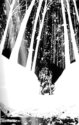
I really liked these illustrations. They have a unique style. I like that the subjects of each picture have a lot of detail while other things in the illustration do not. They flow very nicely with one another. Even though these illustrations lack color, the illustrator was very successful in creating a wide range of shades. The technique used for the animal's fur is very interesting and effective. Kako was the illustrator of these images and they were designed for the Brazilian edition of Jack London's White Fang. I found these images in the July/ August edition of Communication Arts.

Monday, October 26, 2009

Faces


I really like these illustrations because I find them to have some abstract qualities but also to be very realistic. They are almost in the style of comics. The two males faces in particular are interesting to me. They have a lot of character and cause me to wonder what's going on in their heads. Turning a photo into something looking similar to this may be somewhat simple to do on the computer, but this artist used ink on rice paper. It was found in the July- August issue of "Communication Arts." The illustrator is Kagan Mcleod. These images were used in an international film festival yearbook. What a new take on yearbook images!

Tuesday, October 20, 2009

As I'm posting this, my mind is in the gutter and I can envision other interpretations of this design...


This design immediately caught my eye because of its bright colors and uniqueness. Reading the accompanying article provided me with information that made the design even more impressive and intriguing. Apparently there are many advances being made in skateboarding. This board is for "freeriding," which is characterized by high speeds, spins, and slides. Comet, the company that produced the longboard actually let its users design it. The internet was used as a means to share ideas regarding the design. This board is named "the Flying Spaghetti Monster." After reading this I could totally see the reference, however it was not obvious to me prior to that. I probably would not have been in favor of that name but I think the designer(s) did a good job of making something that I find unattractive, look cool. I guess maybe I do like spaghetti monsters...
This design was found in the October, 2009 issue of I.D.

Monday, October 12, 2009

Count me in


I'm going to Las Vegas on Thursday to celebrate my 21st birthday. I thought that this was an appropriate image for this post. I really like that the cards in the deck are each unique from one another. Seeing one card would not tell you what the whole deck looked like. They are also very non-traditional in other ways. The illustrations on all of the cards are very original but the face cards in particular send messages. I found this in Communication Arts magazine.

playground


This is a somewhat atypical choice for this blog but I think it definitely illustrates good design. The design that is used to store the play pieces is very accessible and organized. The pieces seem durable, creative, and kid-friendly. An article accompanying the pictures revealed that the park was designed following the September 11th attacks in New York. The picture of the stored pieces makes me want to play with them. I found these images in the 2009 September/October issue of I.D. magazine.

Tuesday, September 22, 2009

Beards and Moustaches Compete


I found these posters in the October 2009 issue of "How Design." They were designed by Neel Williams and Jason Nitti for the South Central Alaskan Beard & Moustache Club. I thought that these designs were very clever. Two of them use representations of what we may expect to see in a competition. The way in which the type fits into a square is really nice. The posters are eye catching and well done.

Tuesday, September 15, 2009

Some fruit for your nose...


I found this image in the most recent issue of "Communication Arts." I'll have to check back at the library to find out the exact issue. These Kleenex boxes caught my eye. They are cute and refreshing. The colors are bright and very representative of ripe and juicy fruit. I'm not sure what fruit has to do with tissues, but I've noticed Kleenex has been making some decorative tissue boxes for some time now. These have got to be attractive to some of the many with the swine. I think that their shape saves space in addition to requiring less material. I would appreciate a grapefruit Kleenex box as well.

I decided to do a google search on the Kleenex fruit boxes and found that they were exclusive to Target and designed by Hiroko Sanders. From the comments I have read, they were well received, marketed towards college students within dorm decorations.

Friday, September 11, 2009

"When everyday movements seem impossible"


I found these images in an issue of "Communication Arts." They were used for an advertising campaign for a product effective at reducing pain in both hand and knee joints when applied directly. Their headline reads, "When everyday movements seem impossible." I was intrigued when I saw these images and it made me wonder why they were using such extreme perspectives. I think the advertisements look great and playful.

Monday, September 7, 2009

The beginning again

Well, I haven't made it to the library yet, but I thought I'd better post some artwork that I found to be stimulating. A friend of mine gave me a huge stack of books she didn't want anymore- many of them include stock photography and some include design. I have been slowly piecing through these books. The one in which my selections are coming from in this entry is called "365 Aiga Year in Design 21."
This design was done for an international anti-poverty law center. I think this is a wonderful design. I did not immediately understand that the 0% nutrition facts were representative of starvation. I just thought it was clever to put the nutrition facts in the mouth, since that is where food goes. Their intended meaning was so much more clever than I could even imagine! The illustration is also very captivating. It is what first made me stop on this page. One can certainly see the sadness in those eyes.
This is a book cover for an autobiography about Savion Glover, a tap dancer. I was particularly moved by this cover because I have seen him perform and I think it really captures his essence. The designer has used movement and dance as a theme in the cover, as you can see by his forward stance and standing hair. The designer chose to capture his movement in this way rather than in the obvious ways of capturing his feet or whole body. That being said, I'm not crazy about the type font, variation, or color. I have included a picture I'm in with Savion Glover when he performed at the Krannert Center.
Though somewhat cliche, I thought this was a good design. The type which is going off of the screen says "A Cutter's Memoir." The cuts the designer used were very attention- grabbing. I actually thought that someone had cut that page. They resemble cut cardboard or paper, but not flesh. Perhaps that was the intention. I think it worked better that way.

Monday, August 3, 2009

Dun da da!


This is the finished product. As you can see, she's lovin' it!

I know my faces are getting monotonous...

Sunday, July 19, 2009

some sketches


The first one drawn from objects and the second from a photo.

Sunday, July 12, 2009

I'm not posting a new sketch quite yet. I went to Chicago yesterday and got some information on the Academy of Art University in San Francisco. It looks like a really cool place. Before I can apply to any of this or any other schools, though, I need to get a portfolio together. I'm thinking of going for graphic design, but I'm worried about if I have enough experience and knowledge about it. Needless to say, much of the work I have for a portfolio so far does not include graphic design. I took some photos of UofI's February dance concert that are posted online. My mom was one of the choreographers. I'm trying to decide which of these photos- if any, could be included in a portfolio. Any feedback would be greatly appreciated!

http://picasaweb.google.com/yaindasqueet/FebruaryDanceWhiteOut#

Wednesday, July 8, 2009

Cat love


My dad is building my kitty a mansion so that she can look out of a tall window in my apartment to come. This is a sketch of the structure and my kitty.

No looking- more or less concentrated?


In past drawing classes, I have been assigned to draw something I'm looking at, without looking down at the paper. Sometimes, using a single line has also been encouraged. This assignment has always been a struggle for me, so i decided to challenge myself and try it again! It is so hard to stay focused when you can't look at what you've created. This is my attempt of some flowers.

Monday, June 29, 2009

Monday, June 22, 2009

Past project


I worked on a project once that was similar to the Unity project we are working on now.
This is it...

Sunday, June 21, 2009

Sketch 2


A couple ideas...


Sketch 1

Process:
I began this sketch during some down time at work. I grabbed a pair of glasses that are for sale in the store and made a rough sketch of them. The face just naturally followed the glasses. I did not intend to send a "green" message when I started sketching. It just sort of evolved into that. At my other job, I'm checking the air flow in fume hoods on the UofI campus. I'm a little jealous of one of my co-workers who gets to make various posters and brochures for the environmental compliance department. Perhaps this was my unconscious attempt to compete?