skip to main |
skip to sidebar
The beginning again
Well, I haven't made it to the library yet, but I thought I'd better post some artwork that I found to be stimulating. A friend of mine gave me a huge stack of books she didn't want anymore- many of them include stock photography and some include design. I have been slowly piecing through these books. The one in which my selections are coming from in this entry is called "365 Aiga Year in Design 21." This design was done for an international anti-poverty law center. I think this is a wonderful design. I did not immediately understand that the 0% nutrition facts were representative of starvation. I just thought it was clever to put the nutrition facts in the mouth, since that is where food goes. Their intended meaning was so much more clever than I could even imagine! The illustration is also very captivating. It is what first made me stop on this page. One can certainly see the sadness in those eyes.
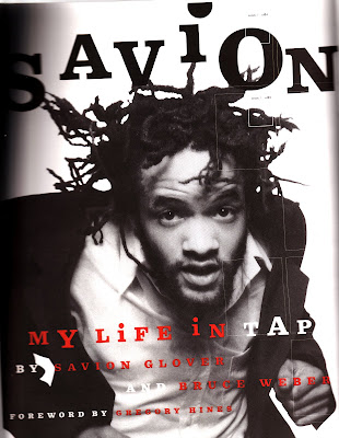 This is a book cover for an autobiography about Savion Glover, a tap dancer. I was particularly moved by this cover because I have seen him perform and I think it really captures his essence. The designer has used movement and dance as a theme in the cover, as you can see by his forward stance and standing hair. The designer chose to capture his movement in this way rather than in the obvious ways of capturing his feet or whole body. That being said, I'm not crazy about the type font, variation, or color. I have included a picture I'm in with Savion Glover when he performed at the Krannert Center.
 Though somewhat cliche, I thought this was a good design. The type which is going off of the screen says "A Cutter's Memoir." The cuts the designer used were very attention- grabbing. I actually thought that someone had cut that page. They resemble cut cardboard or paper, but not flesh. Perhaps that was the intention. I think it worked better that way.
 This design was done for an international anti-poverty law center. I think this is a wonderful design. I did not immediately understand that the 0% nutrition facts were representative of starvation. I just thought it was clever to put the nutrition facts in the mouth, since that is where food goes. Their intended meaning was so much more clever than I could even imagine! The illustration is also very captivating. It is what first made me stop on this page. One can certainly see the sadness in those eyes.
 This is a book cover for an autobiography about Savion Glover, a tap dancer. I was particularly moved by this cover because I have seen him perform and I think it really captures his essence. The designer has used movement and dance as a theme in the cover, as you can see by his forward stance and standing hair. The designer chose to capture his movement in this way rather than in the obvious ways of capturing his feet or whole body. That being said, I'm not crazy about the type font, variation, or color. I have included a picture I'm in with Savion Glover when he performed at the Krannert Center.
 Though somewhat cliche, I thought this was a good design. The type which is going off of the screen says "A Cutter's Memoir." The cuts the designer used were very attention- grabbing. I actually thought that someone had cut that page. They resemble cut cardboard or paper, but not flesh. Perhaps that was the intention. I think it worked better that way.
No comments:
Post a Comment