Monday, October 26, 2009

Faces


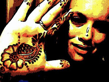
I really like these illustrations because I find them to have some abstract qualities but also to be very realistic. They are almost in the style of comics. The two males faces in particular are interesting to me. They have a lot of character and cause me to wonder what's going on in their heads. Turning a photo into something looking similar to this may be somewhat simple to do on the computer, but this artist used ink on rice paper. It was found in the July- August issue of "Communication Arts." The illustrator is Kagan Mcleod. These images were used in an international film festival yearbook. What a new take on yearbook images!

Tuesday, October 20, 2009

As I'm posting this, my mind is in the gutter and I can envision other interpretations of this design...


This design immediately caught my eye because of its bright colors and uniqueness. Reading the accompanying article provided me with information that made the design even more impressive and intriguing. Apparently there are many advances being made in skateboarding. This board is for "freeriding," which is characterized by high speeds, spins, and slides. Comet, the company that produced the longboard actually let its users design it. The internet was used as a means to share ideas regarding the design. This board is named "the Flying Spaghetti Monster." After reading this I could totally see the reference, however it was not obvious to me prior to that. I probably would not have been in favor of that name but I think the designer(s) did a good job of making something that I find unattractive, look cool. I guess maybe I do like spaghetti monsters...
This design was found in the October, 2009 issue of I.D.

Monday, October 12, 2009

Count me in


I'm going to Las Vegas on Thursday to celebrate my 21st birthday. I thought that this was an appropriate image for this post. I really like that the cards in the deck are each unique from one another. Seeing one card would not tell you what the whole deck looked like. They are also very non-traditional in other ways. The illustrations on all of the cards are very original but the face cards in particular send messages. I found this in Communication Arts magazine.

playground


This is a somewhat atypical choice for this blog but I think it definitely illustrates good design. The design that is used to store the play pieces is very accessible and organized. The pieces seem durable, creative, and kid-friendly. An article accompanying the pictures revealed that the park was designed following the September 11th attacks in New York. The picture of the stored pieces makes me want to play with them. I found these images in the 2009 September/October issue of I.D. magazine.