Monday, November 30, 2009
Hey, do you have a piece of gum?
This is a clever design. I think that Dell had a good idea in portraying their colorful computers as gum in these advertisements. It makes them appear to be something easily attainable, widely used, and fun! I don't even like gum too well and they grabbed my attention!
I found these images in the November issue of "PDN."
Monday, November 23, 2009
It's all about the people
Many of you may have seen this image before. I believe I've seen it on the news before and it was used for the cover of Newsweek in their inauguration issue, "Obama's America." It was featured in the July/August issue of Communication Arts, though. I just think it demonstrates amazing organization and planning. It's amazing how easily recognizable Obama is in this placement of people. Perhaps it can be attributed somewhat to our familiarity with this image in its original form. Nonetheless, it is an excellent demonstration of the concept of Obama being representative of the people. I'm not addressing or implying any political affiliations, though, just to be clear- just good design. Also, Obama says the word "people" in a funny way and often!
Monday, November 16, 2009
AHHHHHH!
So, I guess I am a fan of Kako's illustrations. I used their work in a couple posts back. In this piece they wonderfully conveyed emotion and generated interest. The image is absolutely eye-catching. Like in his other pieces, the line use is very effective. The image was used for Itau Cultural's 2008 video festival "Conflicts." How appropriate! Once again, this information was found in the July/August issue of Communication Arts.
Monday, November 9, 2009
cartoon dress up
These designs looked very cool both as individuals and as a group. They are part of a set of illustrations to promote Microsoft's Zune Zodiac series of mp3 players that feature custom engraving. They are hip and modern and I would imagine that they do a good job of attracting the age group that makes up the majority of mp3 player users. I like each of the color themes used and also the slightly cultural suggestive nature of each of them. It's like they're dressing a person up in very differing outfits. Very cool. As many of the designs previously and to come, this was found in the July/August issue of Communication Arts. It has lots of good stuff!
Monday, November 2, 2009
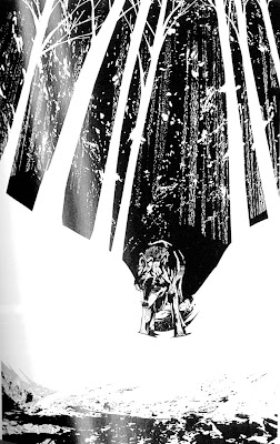
sweet illustrations
I really liked these illustrations. They have a unique style. I like that the subjects of each picture have a lot of detail while other things in the illustration do not. They flow very nicely with one another. Even though these illustrations lack color, the illustrator was very successful in creating a wide range of shades. The technique used for the animal's fur is very interesting and effective. Kako was the illustrator of these images and they were designed for the Brazilian edition of Jack London's White Fang. I found these images in the July/ August edition of Communication Arts.
Subscribe to:
Posts (Atom)